Friday, 23 May 2014

Deadline is on the horizon

It is the night before deadline and this will be most likely be my final blog post for my year 3 reflective journal! Today I have been doing some final printing for my research files and I have just bound my final book so the end is near. I am feeling fairly positive about my submission for assessment as I can safely say I have worked as hard as I can which I hope is evident through the standard of my work and the amount of effort I have put into my presentation. I also have far more work than I have ever had for a submission before, and whilst this workload spans 2 terms my work is probably about the same amount as the whole of year 2 combined. 

Reflecting upon this last term I can't believe its gone so fast and it seems like yesterday I was starting my fairy tale project and yet I have come such a long way in that time. I have really enjoyed working with Indesign to compile my book layouts especially as the layout designs themselves are such an integral part to the overall feel of the book. My Photoshop, Indesign and Illustrator skills have vastly improved over the past term which makes me feel a lot more confident about my future as a freelance illustrator. I never thought I would say it but I am ready to leave university and become freelance as I feel I have prepared myself as much as possible for this moment and I feel positive about the direction my work is taking and the self promotion and skills I have behind me.

My plans for after assessment and the degree show are:

- Make a list of skills to improve and focus on bringing Photoshop, Indesign and Illustrator skills up to an expert standard.
- Expand my online presence with a Facebook page, Tumblr and LinkedIn and keep things constantly up to date
- Contacting blogs, magazines, art directors to try and gain notice, work and be published
- Continue collaboration projects with Henry Jackson and Ashleigh Berryman and try and start new bonds within textiles and graphic design
- Keep working hard!

So that it is for me as I have a few last minute things to finish off for hand-in! 

Wednesday, 21 May 2014

Portfolio collection

After all the effort laying out and printing my portfolio the day has arrived to collect it. Gabby and myself had to go to London to pick them and I am so happy with my final and it has been worth the wait. I'm glad I paid a bit more to have the screws only visible on the back and the whole book is really well made. The only gripe I have is that they didn't score the pages inside so it doesn't lay flat so that is something we will have to do tomorrow which is an uneeded hassle at this point! I'm really glad I chose to have lots of different sized inserts and pages inside as I feel it gives my portfolio a sense of narrative and journey which is relevant to my projects. I'm really looking forward to converting it to a professional portfolio after assessment and I really hope an oppurtunity arises soon to send it out! 


My precious portfolio


The annoying thing with having to take a day out to go to London is that I've lost a lot of valuable working time as I had to borrow a laptop with a working battery and even then I couldn't charge it so I was left writing my project summary by hand. Tomorrow I need to print my second book ready to be bound and finish off typing up and arranging my research file to get them bound in the print rooms. I feel like the next day is going to be very stressful but it can be done! All this extra effort takes time...

Wednesday, 14 May 2014

Unexpected trip to London

I can't quite believe it but I am on the way to London! With the year one and two's hand in on Friday the print rooms are the busiest I have ever seen; yesterday some people were queuing over 2 hours for a computer but luckily I have been managing to get in early enough to grab one. However the print queues are horrendous, often 10 people at a time and the amount of times things print wrong or don't load onto the printers properly and I have to re-queue has slowed me down a lot. It doesn't help that the Guntons printers seem to decide to throw a strop several times a day and leave marks allover my prints!


Layout for portfolio concertina


As the delays have been a lot more severe than I expected I wasn't able to finish printing my portfolio in time to post it off to the printers and so here I am on the train to drop them off which means another journey using up valuable time although it is quite nice to get away from the print rooms for the morning. I think printing has taken even longer because I have been quite ambitious with my layout and scaling as I want my portfolio to feel interactive and tactile as well as professional. However it also means the layout and order of my portfolio is quite confusing so I am just making up a paper mock up to leave with the binders to make sure everything goes correctly.


Fashion development portfolio page


The good thing about printing my portfolio 9 days before hand-in is that I now have that time to focus on paperwork and printing and binding my final books to go in with my portfolio. This is probably the most prepared I have ever been for a hand in which is comforting to know although it's needed as there seems to be so much more work involved. I am going to sit down later tonight and make a final list of the work left to do for hand in to make sure that nothing will be forgotten.

Friday, 9 May 2014

Joint crit with Glyn

I have been finishing my final book layouts and illustrations over the last few days in preparation for portfolio mock ups this weekend and printing on Monday. This afternoon I had a joint crit between Gabby, Glyn and I to discuss portfolios and last minute changes. 


Idea for portfolio layout


I'm really glad I had Gabby as my crit partner as we have been working so hard together and it's such a nice feeling to see us both bringing everything together for the end. We both also have similar ideas for how we want to layout our portfolios so it was a good opportunity to ask questions that we both needed answers to. I found it helpful as we discussed having final books in the portfolio and Glyn recommended having them outside of it in an archive box with the portfolio which I really like the idea of. Unfortunately I haven't got the time (or budget) to get a custom made archive box to match my portfolio at the moment so that is something to think about after assessment and I will possibly get one from the university shop for now to keep the books together and give an impression of what I wanted. Glyn also seemed to like the idea of an unconventional portfolio in the sense of different paper qualities, scales and folding pages and so I am looking forward to mocking up my portfolio ready for printing. All this work with Indesign for my final books has really got me into book layouts and I think it's something that I will really push on with this summer.

Monday, 28 April 2014

Final push

The Easter break is over and the stress is on; it's the last 3 weeks before hand in. After an Easter break that has been nowhere as productive as I would like I'm feeling the stress! I'm annoyed as well as I'm having to miss my crit for this week as I'm going to London for my portfolio review which I didn't realise but the date couldn't be changed. While I was at home I was reading through 'Creative Block' by  Daniella Krysa and came across an article on Arian Bahzadi that had a quote that will stick with me during this countdown:

'If you're not suffering from lack of sleep, you're not doing it right.'

It's time to knuckle down and work as hard as possible now to do as well as I can. I've made a list of everything I need to do this week which involves updating research files, finding primary research and putting practical work into full steam ahead. Hopefully with dedication it can be done; as Paul Arden said:

 'It's not how good you are, it's how good you want to be.'


'Series II', Arian Behzadi


It also occurred to me today that I ought to create a personal development file as I have created a Twitter, website, creative CV and blog etc as part of this unit and I ought to put that all together to highlight the work I've done and to show how I am developing into a professional individual. I also need to get business cards printed as soon as possible- that can be added to the to do list.

Friday, 25 April 2014

Portfolio planning

With less than 4 weeks to go until hand in, creating my portfolio is at the forefront of my mind. I have spent the past few days doing some research into different options and companies and I have defiantly decided I want something individual and custom made. I don't want plastic sleeves as personally I find them a bit tacky and I'm not sure I want to be committed to one screw post book. I want my work to be handled and appreciated meaning a box with a mix of printed material seems a good option, but I still want it to look refined and professional.


At first I was drawn to the idea of a wooden box and I was aiming to commission a friend to make me one. However when I started researching how I wanted it inside it became less practical as I would want a professional inside with slots and indents with ribbon pulls that would be hard for a binders to then fit inside. I found myself become more interested in the options that were available from book binders as they often have portfolio designs tailored to the client's needs.


These designs from Nicole Anderson's studio in America show some really great packaging designs for the different products. I like the triangular fold out envelopes that can hold a few loose images as whilst most of my work is book-based it would be nice to have an option for any singular images or material that is better as small prints.


I liked the design of this clamshell portfolio as it is simplistic yet effective with a standard hard bound book but with an individual fine art print that slides out underneath with a ribbon pull. This makes  nice combination of printed media and again confirms my idea of having different materials together that can  pull out individually to be handled that you can't experience with plastic sleeves.


This example is a fairly simple and classic design but I was drawn to the way the book is indented into the casing with the slot for the business card opposite. It again shows me how different materials can sit together in the same housing in more innovative ways. I think ideally I would like a printed book indented in with an area for a smaller booklet such as the business card above and possibly a double indented box with pace for the triangular fold out sleeves.

As I am so unsure I have booked an appointment with the London Bookbinders on Tuesday 29th in order to talk over my project, and hopefully should budget allow, get it in the making. Luckily it also coincides with the Pick Me Up fair at Somerset House for some fresh inspiration!

Wednesday, 23 April 2014

Brothers Grimm tales

After getting frustrated a few days ago at how my Easter productivity was going I am still feeling the same but trying to work through it. I have managed to do some more development on 'The Valley of Restlessness' but I still only have 2 half finished illustrations out of 3 finals. I think the solution will be to focus on the main fairytales I want to illustrate and work on the Poe poem as a side workshop to keep myself experimenting and give some creative relief when I get frustrated with the other work.

I have been looking into the Brothers Grimm fairy tales as I feel the sinister undertone is what I am looking for in my imagery and I have narrowed it down to three: Hans the Hedgehog, The Seven Ravens and The story of the Youth Who Left Home to Learn Fear. I narrowed it down to these three as they inspired me the most and I began getting visual ideas, possibly because they are all quite straightforward and dark. I find some fairy tales go off on strange tangents and bring in more unnecessary characters where I prefer to focus on the main protagonists and their journey. Hans the Hedgehog is about a son who is top half hedgehog, bottom half man and is judged by his family and peers so he rides off on his cockerel into the forest on his own adventure, which is undeniably a unique tale. The seven ravens resonated with me as I like the idea of a flock of cursed brothers saved by their sister on a long journey to recover them. The Story of the Youth Who Left Home to Learn Fear is a really dark and magical tale full of ghosts, ghouls and bravery and I am particularly excited to start planning my visuals for this story.


David Hockney's Brothers Grimm tales


The next stage is for me to start story boarding and drafting up some initial ideas so that when I start working on visualising my ideas I will have a range of ideas to reference from and keep me focused on what originally inspired me. Power on!

Monday, 21 April 2014

Easter frustration

It is half way through the Easter holidays and I am finding myself a bit frustrated! Things with family are finally getting back on track with my brother moving to my town which is brilliant but unfortunately the move and practicalities have left me with very little time to work. I am trying to spend as much time as I can in my spare time but it is a set back never the less.

I wanted to complete 3 illustrations in response to Edgar Allen Poe's 'The Valley of Restlessness' as a short day or so exercise to get me back into practical work and the new project. Unfortunately I haven't had a whole day to do this so it has been spread over several days and I haven't had the time to resolve issues as fast as I would like. I currently have one illustration in the making although I am extremely happy with it. I am wanting to move more in digital collage and mixed media layering after the success of my UEA collaboration and this illustration has helped me feel confident that this is the right direction to go. The conflict I am having is trying to blend hand-drawn material with digital as it worked well in my UEA work as they were on separate pages in the book but complemented each other, whereas here I am trying to have them in the same illustrations as I don't think they'll work separate this time. I suppose the solution is to go all digital or find of way of subtly including some hand drawn illustrations and textures in the final images.


'The Valley of Restlessness'


The idea behind this illustration is to show the men in the valley before they go off to war and th valley becomes 'restless'. I have combined 4 different photographs and coloured the different layers to create some depth and atmosphere. I want to play around with removing their eyes to give a sinister feel that they are now dead at war and bring in that sense of foreboding in the valley.

The next stage is to keep developing and try and get as much work as I can before I return to Norwich for the last term. There's nothing I can do but plan and try!

Friday, 28 March 2014

Tutorial with Glyn

Today I had a meeting with Glyn to show him my Zara mock up book and get some advice on how to develop before printing the final version. I have prepared most of the page layouts and text and I think the ordering is almost right as it flows nicely between the illustrations and pieces of text promoting Zara.


One of my development illustrations for this project


After speaking to Glyn I have realised that the basic structure is there but it needs to be a bit more exploratory and edgy so I am going to play around with composition and the placement of my text. At the moment it is all fairly conformative in layout and I liked Glyn's idea to make the scales more extreme and play around with how much of the model the viewer can actually see- I forget sometimes it's OK to not have all my illustration in and cropping can make a huge difference to the success of a piece- sometimes less is more. I realise all my text is also straight and it could be nice to have things at angles so that the viewer is more involved in the book, turning it around to view things which will mean they interact with the feel and flow of the book more.

I want to get this book finished by Easter so it's a final push for the next week.

Wednesday, 5 March 2014

Change of plans

After submitting my Hermione Hammond award I was hoping to move onto a D&AD brief but after some deliberation I have decided to continue my fashion project as I feel it is not yet exhausted or concluded and I want to push it forward into a new project to replace the D&AD one. I also feel uninspired by that brief now so it seems a bad choice to drop a project that is already pushing my skills and methods whilst also inspiring and exciting me.


I am hoping to move this project towards a book after the success of my UEA project and I want to explore collage, layering and texture more and the use of different surfaces and paper stocks after it worked well before. I plan to get this project resolved as soon as possible to move onto my fairy tale project but realistically I will give myself until the Easter break to finish.


Antonio Soares fashion illustration


I think the next stage is to continue with my research and start formatting some ideas for the direction and conclusion of this project as currently I don't feel finished but also don't know how to finish. After a tutorial with Glyn I think I need to find some more substance and themes to the fashion to give it a context and substantial content.

Saturday, 1 March 2014

Hermione Hammond Entry

I have finally finished my Hermione Hammond competition entry after spending hours painstakingly drawing hair. I am really happy with my final as I feel it does how good skill and representational drawing as the competition asks for. I hope that it will be memorable and striking enough for the judges to favor it for winning! Going through the process of working to a competition deadline has been a good experience to prepare me for working to tight deadlines in my future career and preparing my files for submission will make it quicker for any future competition entries. This is the first competition I have entered and I feel it has been a good place to start as it is a fairly small competition and I now feel ready to approach some larger more publicized competitions.

My final piece

Friday, 28 February 2014

UEA collaboration exhibition and reflection

Today we had an exhibition of the work we have done for our collaborations and some of the work was really fantastic and it was interesting to see how varied and unique our work can be as a course. I was really nervous to meet my collaborator but she was lovely and seemed really pleased with the final outcome. We split into groups and discussed the projects with the UEA tutors and then mingled as the tutors assessed the UEA students individually on the experience.


Embedded image permalink
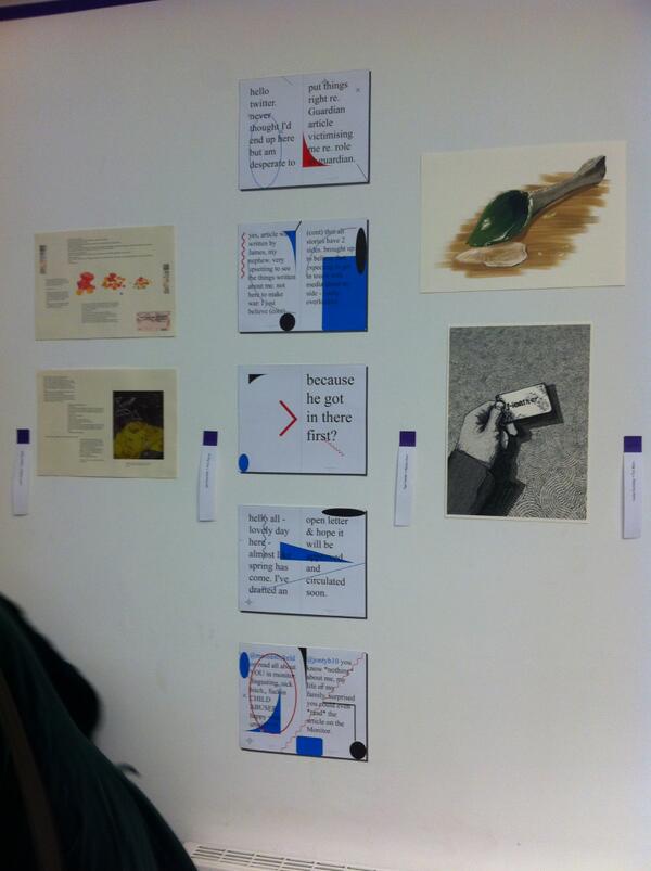
Work on the walls from exhibiton


I am really happy with my final outcome, I really feel it has completely changed my outlook on my illustration practice. Having to work so fast and respond to text so spontaneously and quickly was so unlike the way I normally work which is slowly and too preciously and has caused me a lot of problems in the past. I also had to keep my imagery simplistic but bold and effective which resulted in me using digital collage which is something I have never done before. I feel like I have stumbled across a working method that instinctively suits me and working digitally allows me to bring my illustrations in, make new ones and not worry about making mistakes as I can undo things and save different versions. I also really enjoyed working with the book layout and how the different pages work together to reveal the imagery and so I am even more excited and involved in my other projects. This collaboration has been a really positive and enlightening experience and I have enjoyed working with written matter I wouldn't normally approach as the themes were out of my comfort zone. 


My final illustrations


After this experience I think it is important for me to apply the skills and methods I have developed form this project to my other projects as I feel that will really push my practice forward. I hope to keep in contact with my collaborator to possible develop future collaborations.

Tuesday, 25 February 2014

Artist statement workshop

Today I had a workshop on writing personal statements which is something I haven't really considered until this point as I haven't had to write one. It was interesting to see a selection of statements written by others as it forces an artist to concisely portray the motives, ideas and ambition behind their work in a short paragraph. I think this is a great exercise even if the statement is not to be used as it forced me to pinpoint the aspects of illustration and motivation behind my work that drives me to be an illustrator, which essentially helps me to know clearly what I am about and what I want to portray to my audience. A personal statement is usually 100-200 words and therefore has to be succinct and clear to pass the relevant information across to the reader.


'Blowlion', Andrea D'Aquino


I had a look at some examples of professional illustrator statements on their websites and they generally take the format of how they came to be, what they have achieved and what they currently do. An example of this is Andrea Daquino's website statement that roughly follows this format:

'Andrea D'Aquino has always resisted labels like "art director", "illustrator", "graphic designer", or "writer", and finds herself happiest straddling the line between all those things. For several centuries she was a senior art director for major advertising agencies.

As an illustrator and designer, clients include Anthropologie, The New York Times, Elle Magazine, Vegetarian Times, PlanSponsor Magazine, Family Fun, Chronicle Books, Uppercase, Flow magazine, and many others.

Her work has been recognised by Society of Illustrators, American Illustration, Art Director's Club, Communication Arts, 3x3 Magazine, The One Club, and The Type Director's Club.'

Her statement is concise and promotes her well as a highly recognised illustrator and skilled artist and designer who has achieved a lot in her career. I would say it lack a bit of personality and should have a short sentence about what she is currently doing or aiming for, such as future goals. Other illustrators such as Gemma Correll have listed any blogs or columns that they currently contribute to or publications they are working on.


'Untitled', Gemma Correll


I found it quite hard at first to define my practice in so few words and it took quite a few rewritings. It was advised that the statement should conclude with ideas for the future and our goals which was quite satisfying to see written down in a statement about me, as if it is a plan to come and not just a dream. This is my final statement for now:

'My illustrations are inspired and sourced through found texture and mixed media materials that are blended and layered together to depict a sense of atmosphere, place and character. My work currently responds to space and surface, place and character. My work currently responds to space and surface, aiming to push the boundaries of the paper medium through cutting, folding and layering my materials both within and outside he constraints of the physical book format. 

My work responds to narrative both through fictional storytelling and character experience. I produce work that targets the publishing and commercial market as a freelance illustrator, aiming to capture and depict a sense of beauty, intrigue and escapism. I enjoy applying these techniques through an extension of fashion illustration and surface pattern design.

My passion for narrative and commercial illustration will drive me as a freelance illustrator as I intend to gain more experience through commissioned projects and internships. My ultimate goal is to launch my own gift and home ware brand.'

I want to revise this for the degree show as hopefully it will be a bit more relevant but it has been good to practice writing it so I know what I am aiming for.

Wednesday, 12 February 2014

Lighthouse studio

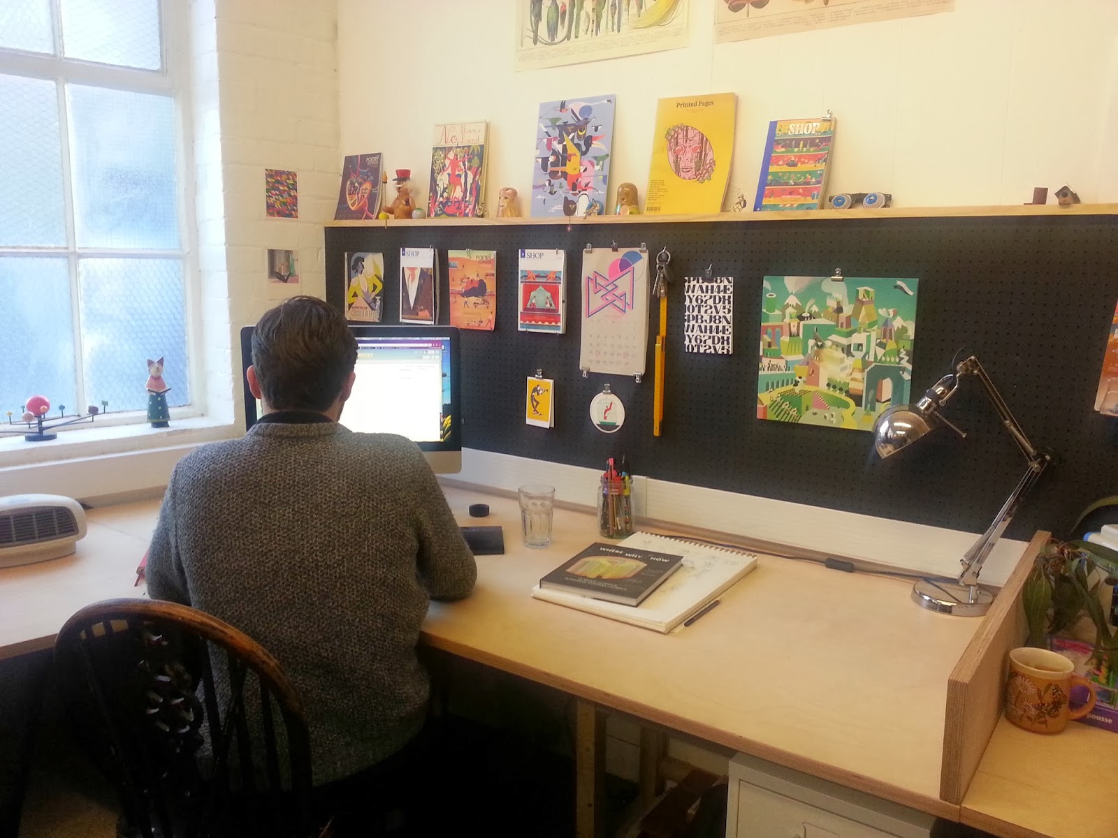
On Tuesday we had the opportunity to visit the Lighthouse Studios in London and see the environment and space that illustrators are working in professionally. I don't know what i expected to see but it was both smaller than I expected and also far more relaxed and inviting. The studio we saw consisted of 8 illustrators working on huge desks with the walls covered in all things arty, bright and inspiring. The back wall had a inboard grid to stick up work, tools and anything they might need which is something I defiantly want for when I set up a studio corner in my home. The atmosphere was friendly but dedicated as they all were working hard with music playing in the background, and we were lucky enough to have the chance to talk to the artists about their working process and what they were currently working on.

Jack Hudsons work is a colourful blend of modern vintage illustration, with soft crayon-like textures and geeky characters on their adventures. I was surprised to find out that his work is digital as it has such a hand-made feel to it. He mocks up ideas in pencil in his sketchbook and scans in his drawings to fill in and colour on Photoshop and Illustrator. He is currently working on some personal work called 'If I were small' with little characters jumping on huge jellies etc for Pick Me Up fair 2014- I will definitely be booking my ticket for that!


Jack Hudson at his desk

Personal work, Jack Hudson


We also had the opportunity to talk to talk to Ciara Phelan, a freelance illustrator and paper craft artist. Ciara works a lot with collage and photo montage and I found it really interesting to hear about her creative process; there is little sketching involved as she mainly works from found imagery and plays around with composition. Her collection of educational and source material books are her go-to for inspiration and she recommended we check out Dover books for copyright free source books, although sadly they are quite expensive. Ciara studied graphic design at Brighton university and moved to London short after to work as a junior designer where she began getting commissions for her collage work which led her to focus on that as a full time freelance illustrator. She has a wide range of clients including Computer Arts magazine and Glamour and her style is bright, fun and lively.


Godesses, Ciara Phelan


I really enjoyed the visit to the studios as it has reawakened some drive and excitement in me to move to London and hopefully become a freelance illustrator in a studio like this eventually. It has been a really great insight as to how illustrators work and where.


Hannah Höch exhibition at Whitechapel

I went on a trip to London today to the Whitechapel gallery to see the Hannah Höch exhibition. Before the exhibition I didn't really know much about Hannah Höch's work which surprised me as she has been such an influential figure and her aesthetic photo montage style really appeals to me. 

The exhibition contained over 100 works from various different collections, following her career from the 1910s to the 1970s. One of the main factors I noticed about the exhibition was the cyclical journey of her work; as her career developed Höch's style became that of cleverly constructed photo montages such as her work 'from an Ethnographic Museum' but then her work goes through a period of experimental abstractism before suddenly returning to how it was before. I like this idea of finding a style that works well and exploring away from it but returning again to what originally inspired her near the end of her career.

"My style had become increasingly abstract, thought I occasionally reverted, especially in photomontages… to themes and forms of the same kind as those of my Dada period of 1920. I suppose every imaginative artist has some recurring obsessions."


Balanced: 'Ohne Titel', 1930


In the 1920s Hannah Höch was significantly influenced by Dadaism, a movement that was born out of a negative reaction to the destruction and horror of WW1, using a form of anti-art. Höch in particular became part of the photo montage movement, using scissors and glue to reuse images presented by the media in a response to their views on modern life. Her work aimed to capture the style of 1920s avant-garde theatre and explore her ideas on the evolution of the new woman in Germany after the war. She found working with found imagery and photography to be refreshing new territory that opened up new avenues for her work, both visually and ideologically:

"The peculiar characteristics of photography and its approaches have opened up new and immensely fantastic field for a creative human being: a new, magical territory, for the discovery of which freedom is the first prerequisite…whenever we want to force this "photo matter" to yield new forms, we must be prepared for a journey of discovery…we must be open to the beauties if fruity…these beauties, wandering and extravagant, obligingly enrich our fantasy."


Flucht (Flight), 1931


Höch's work developed to question stereotypes and the concept of beauty and relationships, often exploring racial and gender clichés. She combined female figures with found objects, shape and pattern to create striking pieces that invite the viewer to question what it is they see. After WW2 her work took  more abstract turn as she aimed to make the origins of her cut-out material less apparent, and her work began to respond much more to the events that were happening in the world around her, such as the advancements in the 1950s in space travel.


Kleine Sonne (Little Sun), 1969


What resonated with me the most about Höch's work was her style and process; her images were calculated and well-thought out with brilliant composition, and yet her edges were rough and it had that choppy cut and paste feel about it. Her works bold and striking with a great deal of care and passion but it made me realise that art doesn't have to be delicate and perfect to portray that which has relieved me a bit of that sense of preciousness about my own practice. I feel that in 3rd year this is something that I am beginning to understand and come to terms with although it is by no means going to be easy to put in practice! It also a great opportunity to see her photographic albums and collage books which were huge portable libraries of material to work with, which is something that many artists are doing today with texture libraries and materials they can quickly access for work in future. I think that I am going to work on composing ongoing texture and found material catalogues to save myself some of the researching and hunting time in future.


Monday, 10 February 2014

Group critique with Peter

I had a group critique with Peter today after seeing him on Friday to ask for some advice for over the weekend. Peter advised that I look over the fashion films and features on Purple magazine and Show Studio and do some quick drawings in response to them to loosen my drawings and work on my observation. Life drawing sessions are defiantly helping to loosen up my approach and pace to drawing the figure but I am still struggling with faces and hands where I freeze up- I find it easy to represent the clothes and folds as clothes have such movement in them that I am just representing how they look at that one time. Everyone knows what a face should look like proportionally so I am a lot more timid in interpreting them and that shows in my work.


Sketchbook drawings from Show Studio


Peter's advice is to consistently draw, every day, all day to improve my observational drawings skills and loosen my hand and my hesitation. I think I am defiantly worrying about working towards a final piece in such a short amount of time and Peter has reminded me that this project is about improving my figure and observational drawing skills and a final piece will naturally develop from that. The key points for me to focus on over the next week are:


  • Use a mixture of life drawing and online observations to draw quickly and improve skills quickly
  • Mix tone, line, detail and negative space- use a variety of tools and line weights
  • Fool myself- start away from the face, working boldly and fluidly and work into the face from various points- put detail where it needs to be but not everywhere, focus on shape
  • Detail is only needed as part of the overall language, not everywhere- the garment is part of the bey, not separate
  • Speed- draw fast, free, consistently
  • Photocopy figure drawings and experiment with detail, tone, layering on top of these

Cecilia Carlstedt's fashion illustrations are a great example of focusing on line, shape and structure followed by detail.


My plan is to approach the fashion department to draw some of their outfits and draw the students making their dresses, continue life drawing and work quickly. I'm going on the London trip tomorrow, so Wednesday morning I will be buying sketchbooks and hurtling forward!

Tuesday, 4 February 2014

Professional development

Preparing for leaving university is something that I think terrifies most students and so it was greatly appreciated when we had a lecture on preparing for work today.

Having a creative CV is vitally important when pursuing a creative career; I have done some research in the past but found the samples scarily impressive and confusing. It was useful to break down what needs to go on a creative CV and what it should be. A CV needs to showcase the individuals skills which includes education and qualifications, relevant employment and experience, expertise, skills and knowledge and personal details.

A CV is a marketing tool and should be treated in such a way; it is a way to promote yourself and highlight what we are good at. A good CV should:

  • Have visual impact
  • Reflect the individuals personality
  • Highlight creative and transferable skills
  • Be a relevant target for the industry or organisation
  • Demonstrate the key skills needed for the position

Other forms of self-promotion can include mail outs and promotional packs with stickers and postcards etc. Tea and crayons collective say the key to a successful self-promotional pack is to be unique, consistent, stay on the radar and don't overdue it:

"Imagine the amount of promotional work sent to art directors day-in, day-out. It must become tedious seeing the same sort of thing in the post everyday. If you are different you'll stand out from the crowd, which will in turn make your work more memorable."


Thereza Rowe self-promotion

Versus collective promotional playing cards


The key is to showing that you have energy, zing and be memorable! I plan to create my CV now and face the battle to stand out.

Wednesday, 29 January 2014

Lecture 2: placements and internships

Today's lecture was on placements and internships. Students who have placements at university tend to be the ones that survive in the industry as it gives them a better understanding of what is required and the opportunity to experience the area they want to pursue. In order to find a placement at university it is helpful to look at where past students have gone as they are likely to take people on again.

Internships can be a great chance to gain experience in a certain area or field after university and learn new skills within a work environment. Ideally internships should be paid at minimum wage but there is a tendency in the arts to expect the artist to do the work for free. When applying for an internship I should reflect upon my key skills and achievements in order to promote myself for the position.


  • Achievments and selling points: researching, organisational skills, competitions and published work, software skills and written work
  • Experience: teamwork, collaboration, platform groups
  • Communication skills: presentations, writing
  • Planning: balancing work, judging learning, deadlines
  • Working under pressure
  • Practical technical skills: book binding, collage, printing, presses


Wyvern Bindery London


Possible employers for placements and internships:

This lecture has made me consider an internship to be a good opportunity for me after university as it would allow me to learn on the job. The downside is finding a paid internship as I want to move to London and won't be able to afford an unpaid position unless it was part-time. I hadn't really considered a publishing internship but I am interested in pursuing publishing as an avenue for my illustration so it could be fantastic opportunity to learn more about how the market works from the publishers point of view.


Dutch Uncle website


I have done some research into internships and found that Dutch Uncle and YCN run positions. Fashion jobs has a wide range of opportunities in the fashion sector and occasionally illustrator positions are available. Inspiring interns is a great website that lists a wide range of internships and there is an option to upload your CV so they can look through their database for any suitable roles. I have applied to Inspiring interns and I intend to work on my application for Dutch Uncle in the future.

Alumni talk: Adam Avery

It was a to my great excitement that today we had a talk from previous NUA student and freelance illustrator, Adam Avery, and to meet the face behind the Suffolk Punch posters that have been on the walls on the uni for the duration of my time here. 


Adam was a real inspiration as his story since university hasn't been an easy one and yet now he is on the path to being a successful freelance illustrator. Leading up to his graduation Adam did an internship at Nobrow and used his degree show and participation in the D&AD New Blood exhibition to network and speak to people about his work. Self-promotional books he produced for his final major project proved to be a useful tool to hand out to people interested in his work.

In the summer after his graduation he was signed with East Wing agency and stayed with them for 3 years, of which throughout he received no commissions and paid around £2000 to the agency in fees. Adam describes this as down to his naivety as he believed that an agency was guaranteed to bring him jobs and wasn't aware that he would need to pay promotional and administration fees despite a lack of commission income. This proves that it is essential to understand any opportunity that arises and be aware of what will happen if reality hits and things don't go according to plan.


Outside of East Wing agency Adam didn't receive any interest on his work for a year which he says was a potentially soul destroying experience of which he battled by focusing on developing his personal irk, online presence and generating interest. This is when he used the contacts he had from his earlier to networking to gain awareness of his work and seek out opportunities for the future. He explains to key is being persistent, polite and asking nicely so that people want to respond and see your work. Adam describes online presence as being key in todays market as it is beginning to overtake the need for a physical portfolio.

After speaking to Wrap magazine at the New Blood exhibition they contacted him a few years after and he created 4 wrapping paper designs for their website. Leading on from this Adam has had several more commissions from clients including The Guardian and has developed his style for commercial illustration, digitalising his process to work quicker and more effectively. 


Adam's key pieces of advice are as follows:


  • Be clear on the avenue you want to pursue- is it commercial? craft?
  • Work hard on self-promotion to gather interest and create mail outs- people appreciate the time and effort of handmade material
  • Make sure to know how to do what might be asked of you- lost out on an extra £200 from a job as couldn't make a GIF that would have taken less than 20 minutes
  • Always work on personal work and developing your subject matter- personal work might come in useful later for commissioned work
  • Keep textures banks etc that you can call upon in quick turnaround commissions

I have found this talk motivating and the key motive I am taking away is work hard and don't give up no matter how bleak and rough it seems! It has also inspired me to create more self promotional material- first website and online presence, then mail outs such as postcards, business cards and stickers.

Tuesday, 28 January 2014

Alumni talk: Tilly Symonds and Topolski residency

Tilly Symonds is a recent graduate of the university and came in to speak to us today about her experiences and progression after graduating and the thoughts behind her work.

I found Tilly to be a particularly inspiring talker as her illustrative style and work is very unconventional; her work is based around music, sound and moving image, exploring a wide range of materials and processes. Her work took this turn in 3rd year and she ran with it which gives me confidence that at a time when my work is rapidly changing and progressing, it is not to late to find my true style and continue to explore working processes.

As Tilly only began working on moving image in February 2013 she felt it was a wise choice to go on to the Royal College of Art in September to study a Masters in moving image in order to gain experience working with other filmmakers and expand her skills.


The projects she is working on at the RCA sound very different to those that we cover as illustrators  at NUA such as acoustic imagery, where they work with personally discovered sounds rather than already recorded music in order to create truly original and interesting imagery. Tilly says the RCA is about collaboration and bouncing ideas off each other rather than about grades and solo-practice; they aim to challenge what exists and to create their own jobs. The course seems to be quite fine art based as they focus on the ideas behind the work rather than the final outcome: 'thinking about practice in a wider context.'


'Moon', Tilly Symonds


This has encouraged me to think about the future of my own practice and whether I want to continue in education or not. I want to continue to learn and develop but I think that is something I need to do outside of an educational institution; I want to learn through experience, commissions and live briefs. Making this choice based on where I want to go, rather than the financial choice that it has been previously, has made me feel a lot more confident about my future and I feel excited to prepare myself for the working world rather than for a Masters.


'City', Feliks Topolski


The same applies for the Toplski residency. Two ex-NUA students who are part of a residency came to talk to us about their experience, learning and future after the residency. The Topolski residency is run by the family of Feliks Topolski, an Polish born painter and illustrator in the 20th century that created autobiographical paintings and colourful portraits. The studio aims to continue Topolski's teachings and refreshing approach through these resident artists. They are taught to have a looser, faster and less precious approach to their work, documenting their surroundings quickly and using unusual materials to loosen their work such as sticks. The experience sounds liberating and refreshing but again I feel that I don't want to continue to be taught theoretically and I want to learn through working as a freelance illustrator in the industry and making my own mistakes. However, this approach to working methodology is something I want to take on board and I plan to conduct a self-initiated project in the same style to loosen up my drawing and work on something fast paced and reportage based.

I am glad to have had the experience to listen to these previous NUA illustration students as it has really made me think about my plans after uni and making the right choices for me

.

Wednesday, 22 January 2014

Web presence workshop

It's really been pressing on my mind recently that I need to start gaining myself a website presence ready for when I leave uni, and preferably as soon as possible to gain awareness before then. I attended an afternoon workshop today on setting up a website and how layout it out and keep it running.

We used Weebly as our platform for learning today but I think I'm going to make my website with Wix; Weebly is easier to use but I feel that Wix has more professional looking templates and layout options. We discussed saving images for web at 72dpi to keep file sizes small and protect ourselves against the work being stolen; I never realised that some people's websites are slow because they have uploaded the file sizes far too big and I don't want someone to put off looking at my work because it's being too slow. 


Lizzy Stewart portfolio: layout research- simple and bold


I learnt all about SEO (search engine optimisation) and how to make a website more Google friendly and easier to find when people search it. The key is to keep the website simple and relevant with page titles and key words. Google analytics is also a great way to keep track of website visitors and data and it generates a unique code to integrate into a website to boost the SEO. 

The key things to remember in a website are to have easy to navigate categories such as:

  • Home page
  • About/ artist statement
  • Gallery
  • Blog
  • Contact
It is also a good idea to have links to external online platforms such as Twitter, Facebook and blogs. 


Julia Pott: sub category links- fun, interactive, organised


I really thought that creating a website was going to be a puzzling, frustrating and lengthy process but I really enjoyed today's session and I think I can get my website up and running in 2 weeks. The hard bit is resizing and saving images and thinking carefully about what text to add. I'm quite excited to set myself up- keep an eye on this space!

Monday, 20 January 2014

Group critique- research reports so far

I had a group critique today on the progress of my research report so far, looking over a chosen chapter in order to give us enough time to read as many as possible in the time. I have written my Introduction and chapter 2 so I took that in to be looked over. 

We spent some time going round and reading each others and making notes so that we could feedback to each other. However, I didn't realise I wasn't even thinking about content I just had my grammar head on which was a bit embarrassing! Although it seemed to work out quite well as no one else was marking spelling, grammar etc so I think it added a good dynamic. I was impressed with the reports overall, everyone seems to be researching their topics in depth and most of them cover interesting topics, such as Emma's that looks at the representation of family in children's books.


How to be an illustrator, Darrel Rees: 
an amazing book with all the useful hints and sensible guidance


The general feedback for my report was positive and I had some good constructive feedback:


  • Use images to break up text and make the information more accessible and clear
  • Possibly try and find someone who has had an experience with a stock agency or question stock agencies directly
  • Check everything is quoted and cited correctly
  • Check chapter for commas, very long sentences
  • Could stock agencies be another chapter? Or balance it out with the other part of chapter
  • Bring in case studies more to illustrate points

My report seems to be well strutted with a good balanced argument and informative points, so I think the next stage for now is to finish off my chapter 2 to make it more balanced and to start on my chapter 3. I'm quite excited to start my chapter 3 as it's about the relationship between an agent and illustrator; what kind of relationship can form and what leads to the most successful partnership. I have done quite a lot of research on this and got some good quotations as well as learnt a lot myself. This research report might be a pain but I've definitely learnt a lot that will help me in future.

Friday, 17 January 2014

Platform session 2: Pick and Mix

Today's session was a follow on from last Friday's professional development session. We continued with our plans for the pop-up shop and divided into smaller groups so we could focus and refine our ideas. These groups were:


  • Research: finding venue, appropriate product pricing
  • Promotion: posters, gaining public interest and awareness of event, branding
  • Online presence: website, online shop, social media
  • Construction: setting up venue, displaying products
  • Collection: gathering products for shop, moving things to the venue

I am now part of the construction group with 3 other people as I am interested in being part of how the shop will look and how customers will interact with the space to take it that step from a gallery space into a shop. We have agreed as a whole group that the shop should be called 'Pick and Mix' so we decided to focus on that for displaying the work. We worked with the promotion and website group to make sure we all agreed on how the shop should look and feel as branding and promotion need to depict how the shop will look when people will arrive. We decided to go with the idea of a classic sweet shop but updating it to feel more contemporary and interactive rather than chintzy, using pinstripe decoration, the idea of pick and mix bags to buy artwork and a printing workshop for people to join in with their products.


In terms of what we might sell we were thinking flat artwork such as postcards and A4 prints, stickers and anything else that people are happy to make and to have pick and mix bags such as lucky dip, 3 and 5 item bags. A lot of us went to Pick Me Up 2013 where they had an interactive stall where people could use the stamps to print their own face they could take home with them, so we thought that if we all made 2 letter stamps we could have an alphabet of stamps, that people could then use to print their name or slogans on products such as sketchbooks, bags and cards. 


In terms of set up and presentation we have looked at other pop-up shows and exhibitions such as the RCA secrets exhibition as we liked the way they displayed their flat postcard art a bit like a bookshop or library and it reminded me of the way pick and mix sweet shops are neatly lined up and divided into sweet boxes on shelves. 

Our task to develop and prepare for next week is that the research team are working on finding a location and the promotion team is working on the shop branding and posters. I am really enjoying working with a team and I never thought that we would be working on such an exciting project in the lead up to our final major show; it's a great opportunity to gain some experience before our degree show and to raise some funds for it through selling our work. I am also looking forward to being involved in the other projects that other groups organise, such as the gallery and exhibition event as I really want to get my work out there and noticed as much as possible before I graduate.