Wednesday, 27 November 2013

Final illustration photographs

Today has been a very busy day as to be expected in hand-in week but why do things always have to go wrong and not right no matter how much planning goes in! I was in the studio this morning photographing my work to turn my tunnel books into flat illustrations that could be used in a book with the help of my photography friends Ashleigh Berryman and Henry Jackson

Getting the set up right caused a lot of trouble as I wanted my images to have atmospheric lighting such as a warm light through the back but also have shadows to show depth and highlights in the foreground, but so many light sources conflict with each other. I found it hard to balance contrasting shadows with soft atmospheric lighting and the front layer kept getting blown out. In the end with lots of experimentation and moving lights and using reflectors I got there and I'm really happy with the final edited photos and I think they make a nice set.


'The aerialists'

'The mysterious circus'

'The stargazer'


I feel photographing my layers has added that depth and atmosphere that I wanted to achieve in my finals and it has created the feeling of magical snapshots from the night circus. It has been difficult to find the balance between editing out the elements that show they are set up as a tunnel book such as the thread and wanting them to still appear handsome and 3-dimensional and I hope I have achieved it! Now onto the portfolio mounting and printing.

Saturday, 23 November 2013

Eureka!


It is the week before deadline and I have had a moment where everything starts to make more sense! After my tutorial with Glyn a few days ago I felt a lot more focused about the direction of my work but with time running out and dissertation draft deadline looming it took a back seat. I've already decided that I want to create 3D layered illustrations or mini sets that I can light and photograph but I was feeling unsure about how to actually construct and set them up. After my tutorial I went to the library and got a book out called 'Papercraft 2: Design and Art with Paper' which is absolutely fantastic; this book is a compilation of any art made of paper and not specific to just book art or model making like they usually are. I am a great enthusiast of paper art but there are artists in this book that I have never come across such as Andrea Dezso and Andersen M Studio.


'Living Inside', Andrea Dezso


Andrea Dezso has created a series of 3D artworks called tunnel books that involve her layering up her paper illustrations and lighting them to create a sense of atmosphere and setting which is just the sort of thing I am after creating for The Night Circus. I had never thought of the accordion-style tunnel book as a way of displaying my layers so I now have a format for my finals which makes me feel much better- especially with 6 days left to go! 


'The Distant Hours', Andersen M Studio


Andersen M Studio has created some intricate paper model stop-motion animations for various promotional clients, my favourite being 'The Distant Hours' to promote Kate Morton's book. The lighting, framing and angles create a unsettling, mysterious atmosphere and the paper-cuts flow so well together and at one point a delicate paper dress swirls out of the soil. This animation and many of the others have really re-inspired me to push on with my own final pieces after I have been running out of steam and letting stress get to me. Tomorrow will be a productive day!

Wednesday, 20 November 2013

Opulence shoot

In my continued collaboration with Henry Jackson I worked on a fashion photography project on the theme of opulence. I was given full reign as the stylist with a mood board he created to pick out the clothes and work with the make-up and hair stylist to translate the sort of look Henry wanted into practical ideas and styles. We chose 3 different outfits in the end with changing hair and make-up for each with the opulent theme with big jewelry and accessories but with a contemporary twist on the opulent theme with clothes from Topshop and Karen Millen. I really enjoy collaborating with Henry as it allows me to try out different creative projects that i wouldn't work on as an illustrator and try out different creative skills. Working on styling helps me develop my skills on bringing different elements together to help create the right feeling and theme which is transferable to my own illustration work. It also involves working to a set brief and time scale which will help me when working with clients as an illustrator.

Here are a selection of the unedited photos:


I'm really happy with how the styling and hair and make-up have come together and I really enjoyed working as a team and will continue to collaborate with photography on future projects to develop my skills and portfolio. 

Tuesday, 19 November 2013

Tutorial to get back on track


After being ill for the past week my work has begun to turn stagnant so I arranged for a one-to-one tutorial with Glyn this afternoon to get some advice on the direction of my work. I feel I have a good amount of experimentation it's just how to bring that into final pieces I am struggling with and needed a fresh pair of eyes to look over what I had.

Glyn was really helpful and was enthusiastic about my use of the clock cogs in my work and suggested I could move forward with that concept of mechanisms and so I have some ideas of how I could make some acrobats out of paper-cuts and cog joints like they are clockwork figures. He reiterated what Catrin advised about reflecting on the atmosphere and setting that originally drew me to the book and try and reflect that in my final illustrations. I am keen on continuing to use layering and paper-cuts in my work but I need to think more about I can successfully bring the different elements together. Glyn liked my tent collages but suggested that they needed grounding to a place and setting so to perhaps consider that when layering them up. The key lessons from today seem to be to really focus on mood and tone of the text and how to reflect that in my work.


'Untitled', Naomi Shiek


Glyn suggested that I look at the settings of films such as The City of Lost Children and Delicatessen to look at the staging and atmosphere they create. We sat down and watched half of the Brothers Quay 'Anamorphosis' after discussing looking into illusion and dimension in my work so I plan to look at some of their other animations and finish watching that one as it was really engaging with a spooky, dark undertone to the imagery. I went to the library after my tutorial to get out the films mentioned above and to also look at some books to try and get an idea into how I can construct and format my final illustrations and I found some really interesting books on mixed-media illustration and paper-craft. The book 'Papercraft 2: Design and Art in Paper' has some really unusual paper-art set ups and 3-dimensional work that could give me some ideas.


'Anamorphosis', Brothers Quay


My next step is to go home and watch the films and flick through my library books to get some inspiration and look more into this specific area of current and emerging illustration practice.

Saturday, 16 November 2013

Papercutting

I have always loved paper cutting although it is a technique I haven't revisited for a while. It can create some really lovely silhouettes and layering that could work with my paper collages and textures, and if done right can be lit to create some really atmospheric shadows and a sense of perspective and setting. I am ill at the moment with a chest infection and being an asthmatic i'm making a nice nest in the sofa at the moment that I don't plan on moving from for a while and paper cutting requires patience and persistence that I can commit to in this position!

I went through my book quotes again and found one that particularly stuck out to me as having unusual imagery that could look good in paper silhouettes. It refers to a clock in the clock maker Herr Thiessen's workshop:

"A large, round cage set on a wooden base that has been carved into swirling white flames. Within, there are overlapping metal hoops marked with numbers and symbols suspended from the top, hanging amongst the visible gears and a series of stars falling from the filigree cap at the top...it tracks astronomical movement...Everything within the cage rotates slowly, the silver stars sparkling as they catch the light."
(The Night Circus, Erin Morgenstern)


First draft cage drawing


I also got my clock parts the other day so it seemed like a good opportunity to use to them in my imagery in a different way. I planned out my first composition on black paper but made the mistake of drawing the interior workings first and the cage after which meant the cage bars distorted and covered up some of my original imagery. It also made it difficult for me to define where to cut as the lines overlapped each other and I quickly cut through a wrong part in an irrepairable way so I began again.

This time I went for more of a spherical shape and drew the cage first in pencil on thick white paper and then added in the moving parts inside, rubbing out overlapping lines as I went to have a final silhouette to cut out.I am much happier with this design as it is less clumsy and more intricate and I spent a lot of time observing bird cages and intertwined hoops to get my perspective as believable and realistic as possible. As the cage was so intricate and the hoops so small I didn't have space to put the symbols actually on the hoops so I put them in the border around the edge which took forever! I'm really happy with it thought and I think by being in the border it looks like a secret language and stops the hoops looking like engraved bracelets.


Finished paper-cut


I am really happy with finished piece and I want to continue with my paper cutting technique and play around with layering textures in front and behind and possibly including real cog parts. It has taken me to best part of 2 days to plan and create this piece which makes it a doable possibility for my final pieces, so I just need to keep experimenting with my composition and layering and start working towards some final piece ideas and bringing everything together; I might try and get a tutorial to get a bit of guidance on incorporating and moving forward with my ideas.

Friday, 15 November 2013

Stargazer


I've been going through my quotes book and one of the circus tents that stuck out to me so much in the beginning was the Stargazer, a tent that contains a ride that allows the viewer to watch the starry sky unobstructed:

'Walls are covered in diagrams, white spots and lines of black paper, framed maps of constellations... top of the stairs they reach a black platform, where everything is endlessly dark save for a circus worker in a white suit who is guiding patrons inside...something like a sleigh or a carriage...tilts backward so they are looking up instead of forward... gentle swaying of the carriage makes him feel almost weightless...incredibly quiet... star- speckled sky.'
The Night Circus, Erin Morgenstern


www.space.com


Therefore I started gathering research on constellations and stars, looking into the history and types of stars that exist. I was fascinated by the lines that form the constellations as to me they don't particularly look like the imagery they are referenced to but I like the geometric shapes that they form and the possibility of layering and mixing up those shapes. 

I began by experimenting with creating stars on paper by splattering and dotting white ink on black paper with a variety of tools and techniques such as skewers and paintbrushes and using them in different ways. I explored recreating the constellations with stitching and in animal shapes to bring in a sense of magic to the paintings. When I think of the stargazer I imagine it to be like lying on my back and looking up at the sky so I cut my ink experiments into circular shapes and I'm really happy with the outcomes; they are quite simplistic but I like the freedom in my mark making when using thread and ink in such a sporadic way. 


Stitching experiment 1


Ink animals experiment


Stitching experiment 2


To develop these I want to experiment with layering them up and printing them on different materials such as tracing paper and acetate to see how the quality of tone and surface change the feeling of the images.

Interview with Chris Gibbs


After my tutorial with Chris he said that I could interview him for my research report as he has been with his been with his agent Arena for over 14 years and so his answers can tell me a lot about the relationship he has built up with his agent and why he feels they are such a useful tool for him that they have had a significant part in his career. A selection of the interview is here:

C.R.:    How long have you been with Arena Illustration agency for?

C.G.:   14 years

C.R.:    How do you go about becoming part of Arena Illustration? Did you already know someone at the agency, did you approach them to be represented or did they come to you?

C.G.:   I took a job as Office Assistant/Manager there, with the real intention of getting onto their books through the back door. It worked! I had gone to see them with my portfolio in the 2nd year of my degree, and one of the agents there at the time was a previous student at Norwich, so we knew the same tutors (one of which, Susan Aldworth) acted as the broker really.

C.R.:    What sort of relationship do you have with your agent? Is it purely professional or more personal/ friendly? Is it a good relationship? 

C.G.:   I was lucky enough to work with Tamlyn when she was a new(ish) agent there, and now she is Director. We have quite a close relationship, both personally and business wise - she has helped to grow my career, and I have seen her develop into a strong business woman. The same goes for Caroline and recently I was invited to her wedding, so the relationships go beyond purely business. This relationship has also allowed some of my students to gain work experience within an agency - so they also trust my judgement.  I also remain close with the former Director Alison Eldred and she still gets me occasional work. They are both lovely, genuine people with strong morals and belief in Illustration.

C.R.:    Have you been with any agents before this one? If so who? If not then how did you find yourself work? Was it easier or harder than having an agent?

C.G.:   Arena have been my only agents - I did get some work before them, but not much and I can't imagine being with another agent - I have heard some bad stories over the years! I can understand why some artists are against agents, but I'd rather have 70% of something, rather than 100% of nothing.

C.R.:    How does your agency promote your work?

C.G.:   Via Illustration annuals, advertising, their website/blog and client liaison.
  
C.R.:    Are you allowed to take on other jobs that are not through your agent? If not has that ever been a problem?

C.G.:   Technically you could, but how could you prove where these people found out about you? I personally don't. It may well be from your agents advertising, and as such they are then entitled to a cut. If you have sought out work yourself, then maybe you should take all the credit and money - but the relationship is important and should be one of mutual growth. If you want to seek out your own work, and get it - perhaps you should rethink the need/value of your agent. Hence, no problem for me but I know of illustrators who have lost agents, or damaged their relationships because of this attitude.

C.R.:    Why do you have an agent? What do they do for you?

C.G.:   I don't have time to get out there with my work, sometimes not even the inclination. They also advise on jobs and the process and help with new promotional work. They can stand up for your rights, and divert conflict and confrontation if jobs become problematic. Most importantly, they can advise on legal issues and contracts. It can be lonely as an illustrator, and they act as your office companions - albeit on the other end of a phone. They also do fab summer and Xmas parties with free beer and food.

C.R.:    Do you ever feel a sense of competition with other illustrators that your agent represents over who are getting more work? 

C.R.:    Do you think it’s a useful tool or important to have an agent in the publishing sector? Does you agent have a lot of experience with publishing clients?

C.G.:   I think it is almost essential in publishing - contracts are more tricky now, and the pressures are immense. it is rare that art directors even have the time to see portfolios, so generally they return to tried and trusted agents to help them solve their problems.

C.R.:    How would charges and commissions work on book illustration? If it’s a cover is it a one off fee or do you get royalties with sales? Does the same apply to inside illustrations?

C.G.:   Generally, it is a one off fee for covers....which may result in further payments for rights, territories and hard/paperback. Contracts are changing however, and now they want all rights, for a smaller amount - essentially a work for hire contract where the illustrator has no rights or ownership to the image. This is a bad turn for the industry and the SAA and AOI are in talks to resolve this crisis. Children’s' picture books remain one of the only areas of publishing where the artists gets royalties, and their initial payment is usually and advance against royalties.

C.R.:    Would you ever consider not having an agent? Why?

C.G.:   Not really, I think they are essential in 2013 and beyond.


Illustration by Chris Gibbs


I find that having primary research such as interviews really helps me to get involved with my subject as to look at it from a more personal perspective and experience that just reading secondary resources. I plan to interview more agents and illustrators to gather more research and I have got lots of books out from the NUA library to look through that have unbiased opinions on what agents do and how they can be useful.

Thursday, 14 November 2013

Clock mechanisms

One of the themes of the book that drew me to it so much in the first place was the juxtaposition of the real and mechanical with magic. Herr Thiessen is the clock maker in the book that creates fantastical rotating clocks in his studio in Munich including the impressive monochromatic clock for the circus that depicts miniature characters and scenes from the circus as time passes. His presence is important in the book both as the clock maker and also as the founder of the reveurs; a group of circus followers and enthusiasts. Therefore I want to bring in that mechanical element to my illustrations so I started thinking how I could do that and the interior workings of a clock seemed the right choice. I find the cogs and metal constructs of a clock intriquing and visually appealing because of the variation of scale, shape and pattern and the possibly to scan and paint with them and also construct them somehow. I went online to try and find out where I could find some and found a 30gram collection of timepiece mechanisms on Ebay for a good price, and when they arrived there are some fascinating pieces of cogs, clock faces and hands.

I have only just begun to experiment with them but here are some of my scans of the pieces so far:


Scan through tracing paper

Scan of cogs in colour

Scan of cogs in black and white


I intended to scan and photocopy them in black and white but it seems a shame to lose the wonderful gold and silver tones that come through on the mixture of smooth and rusty surfaces, so I may have to rethink my colour scheme. I tried scanning the pieces through tracing paper at first to give it a more subtle, dreamy feel which is quite like to not allow them to take over the image but at the same it dulls down the colours. My next steps are to play around with layering and cutting out my scans and looking at using the actual pieces some how.

Wednesday, 13 November 2013

Interview with Jon Cockley from Handsome Frank


For my research report I am doing an industry report on the role of agents for freelance illustrators so it's important that I can get lots of primary research from agents and illustrators to inform my research. I have come up with some thorough questions and sent them out to illustrators and agents and the other day the illustration agency Handsome Frank replied to my email. I arranged a phone call and interviewed Jon Cockley, co-partner of the agency with Tom Robinson.


Paul Blow @ Handsome Frank


Jon Cockley has a history in sales and so runs that side of the business such as arranging client meetings and promotional events which meant he could tell me a lot about how they promote and sell their artists. It was really interesting to hear what he had to say as they are quite a unique agency in that they cover most of their artists fees and allow them to manage their own clients as well as the work they get through the agency which is very generous compared to the policy of most agencies. Here is a selection of our conversation:

C.R.:       Are your illustrators allowed to take on work outside your agency or do you ask for it to all come through you?

J.C.:        No, that’s a good point, that’s another thing that we felt strongly about when we started up the agency. I just felt that we had no right to go ‘ok we will sign you but you owe us part of all your income’ you know I felt that was really unfair. As I said a lot of our illustrators promote themselves, lots of people we signed have been working very successfully as freelance illustrators already for say five or ten years so we felt it would be an unfair thing for us to have a percentage of your earnings from your own black book. 


C.R.:   What areas of illustration do you bring jobs in for? Do you get a lot of editorial or advertising?

J.C.:    It’s a real mix; we do a lot of editorial work in the UK and in the US. We get a lot of work for people like GQ and The Guardian we’ve started working with quite a lot. The editorial work is great you know it’s fast paced, quick turnaround but I think everybody in the industry knows it’s not the most lucrative work; they don’t tend to have huge budgets. So as much as we love editorial work, it’s great because it gives us work to talk about and go out and show people, I think the clients that we most proactively target are advertising because you know it tends to have bigger budgets, but you know we work right across the board, publishing, editorial, advertising and in the music and film industry and those kind of secondary markets.

C.R.:      Do you have a target number of jobs you want to get completed per artist a year or do you have a target workload?

J.C.:     Obviously as any business we have targets that we want to achieve both kind of financially and as a tick list; it’s great to work new projects so it’s not always about how much a job is worth, sometimes it’s great to do a project with a really big client or something that has a huge amount of profile. I’d say we’re very comfortable with that fact that some artists on our books will get more work in a year than others and there are a lot of reasons for that. Some of our artists are quite kind of niche really, as well as traditional hand-rendering and vector illustrators we have people that work with paper and embroidery and modelling clay, and naturally more niche a technique is the less jobs that person might get but we’re very comfortable with that. There are some people on our books who are flat out busy all the time and have numerous jobs per week and people who we will find less work for. It’s essentially the case that when you find jobs for those people they’re bigger jobs. There’s no kind of target as such, there’s no kind of quota they have to have to hit or anything like that.

C.R.:    How many staff do you have working for you?

J.C.:     There’s just two of us full time. 

His answers will be really helpful in defining and supporting my research report. A phone interview seems to definitely be a much more thorough way to gather research as I can really delve into the questions but unfortunately not everyone is available by phone!


Handsome Frank logo

Tuesday, 12 November 2013

Reflection and geometric experimentation

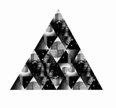
After looking at Jelle Martens work and the idea of illusion and fragmentation I wanted to try experimenting with this idea myself. I went back to the text and looked at what could work and the maze in the book has a series of rooms that lead off from each other and one of them has a lamppost in snow that is reflected in mirrors that cover the walls to look like an endless hallway. 

I started by drawing the lamppost in snow ready to manipulate and I felt that graphite would allow me to create a soft glow around the lamp and get the contrast between white snow and night sky around the lamp.

Lamppost maze room graphite drawing


I then scanned that in and played around with fragmenting it to create a mirrored effect of parts of the lamp as if it was fractured in the light from the mirrors. I felt that a triangluar shape like in Jelle Martens work was a good idea as my tents are that shape so it might create a sense of unison between my imagery, but I also tried juxtaposing this with the spherical shapes to represent the round glow from the lamp.

I tried breaking it up this circular shape but I felt that not enough of the lamppost was on show but I liked the triangular pattern so I tried it in a larger triangle.

I reflected the lamppost a lot more in this shape which I felt gave it more a feeling of a mirror reflection and fractured look to it. I though that it seemed a shame to lose the original lamppost shape so my next step was to try combining them together.
This composition plays with the idea of the lamp being in the circular format like a light glowing on top of the triangle which is think works well but I don't know it feels too disjointed.

Here I have put the lamppost in the centre which i quite like as its softer than the image above and I like the way the bottom of the lamppost blends and meets part of the reflection in the triangle.

Overall I am happy with these experiments but I'm not sure they capture the sense of atmosphere and setting very well- they work nicely on their own but don't really work with some of the other ideas and collages I have also been working on. The next step is to think how i can include that sense of illusion or the unusual within my images and other collages. Perhaps some more abstract mechanical parts could work.

Castle Museum visit

To look at the appropriate costumes that the characters of the book would wear during the time period of the book I went to the Castle Museum. They have a collection of women's fashion on show and I looked at the appropriate styles from the early 19th century to early 20th century and took some photographs of the fashions and some drawings to get a feel of the shape and flow of the dresses on paper. 


Childrens dress, 1880

Lady's overcoat

Cotton dress, 1815-18

I found it really interesting to see how the fashions and styles have changed and some of the dresses have fantastic structure and shape to them.

Monday, 11 November 2013

Group critique- looking over practical work

After my panic about where my practical work was heading I was ready for the practical group critique today. The focus for our feedback was allocated to the learning objectives:

  • LO1: Demonstrate consistent knowledge and understanding of your subject area, making detailed reference to current and emerging practice
  • LO2: Identify issues or questions relevant to your subject and adopt established research methods, clear analysis and appropriate written and visual communication through a draft research report
  • LO3: Evidence a clear understanding of contextual, historical and ethical concepts using research material from a variety of sources relevant to your own practice
  • LO4: Plan your learning, using a range of techniques, references and approaches appropriate to your subject
  • LO5: Evaluate a diversified field of information and ideas in order to make informed judgements about appropriate questions and potential solutions to problems
  • LO6: Communicate creatively and appropriately to a variety of audiences using spoken word, text and images

I was amazed and terrified to see how much development work people have done already- Lucy Timm's theater project has really taken off with some great idea progression and possible outcomes already. I am feeling really stuck about how to move forward as I feel like I have so many ideas in my head but don't know how to put them into practice. However I got some positive feedback and constructive ideas so I'm feeling a bit more focused now and need to power forward. The group liked how I have taken quotes from the book and categorized them so I can quickly reference from them when drawing. There was also positive feedback about my marbling pieces and suggestions that I convert them to monochrome and use those in my collages which is a great idea.


Collage by Jordan Clark (4)
Lee Ho Hand Pip Ho, Jordan Clark

D. Mon Chill Drin, Jordan Clark

The main point to move forward seems my tent collages as people saw potential for development so I think i need to keep playing with collage and also layering. I liked Lucy's layering of acetate so I may try layering some of my textures and collages to make illusions within my images. Catrin also said that the collages were my strongest work and to definitely move forward with them which I was quite glad to hear as it's the work I enjoyed creating the most. 

Catrin's feedback also stopped me panicking so much about capturing the story perfectly:

"Try to match your illustrative approach to the ideas that excited you in the book. Rather than attempting to illustrate particular moments allow yourself the freedom to pursue your image making- particularly the collages."

Therefore my next focuses are to get my research file up to date and to continue to experiment with collage, texture, layering and lighting.

Saturday, 9 November 2013

A miniature circus

After making my circus tents collages yesterday I wanted to move my exploration to 3D to see if whether my  work could move in that direction. I used some construction paper I got from the NUA shop as it made the model making part run more smoothly and I liked the pattern created by the perforated triangles. My first tent is more like a blank shell to work on the shape and design and for the other tent I spent more time thinking about how it would look and what textures I would use both inside and out. 


I chose to use two different textures as I really like the wood grain but the white mortar of the brick wall seemed a good way to create a defined set of tent doors. I like working in 3D but I'm not working on model tents is particularly working; it feels to ridged and confined so I might be better sticking to layering my work to create a sense of dimension within my 2D imagery that literally creating models. I attempted to make a mini circus scene of a collection of model tents to see if that could be more successful but again I feel too refined by the practicalities of model making and it doesn't feel as atmospheric or powerful as my tent collages do. I do like the circular pathways though it does create a sense of continuity. 


My aim for this weekend is to spend some more time gathering research for my dissertation and emailing people to interview. I have a group critique on Monday for my practical work so I am hoping they will give me some guidance on how to move forward with my ideas and I can spend time before then on my research report.

Friday, 8 November 2013

Tent collages

I want my artwork this project to move away from the restrained work that I sometimes tend to make when controlling my materials, such as drawing with pen and pencil. A lot of the contextual illustration I have been looking at is mainly collage or mixed media because I am drawn to the appeal of mixed textures and layering materials such as in Sybille Schenker's 'Hansel and Gretel'. After collecting my textures around Norwich I wanted to experiment with making my own collages.

It seemed a good place to start with the atmosphere of the circus and the mixture of stripy tents in all sorts of sizes and to try and replicate a sense of depth and variety in monochromatic textures. My first collage played with layering them to try and create a sense of depth and seeing how the shapes could work together and what textures were working better than others. 


Collage circus tents 1


I am really excited by my first collage as it is so different to the work I normally create but I find that refreshing; the process in this image making was more in the selection of my materials and my composition whereas I normally spend more time focusing on how to draw as accurately as I can. I think being more abstract allows me to free up my mark making and content more as these are my version of the circus tents from the book; I am not trying to replicate the stereotypical tent that everyone knows and recognises. I think this approach is more suitable as well because The Night Circus is meant to be unlike anything we have seen before, it takes a form of entertainment we all know and love and turns into something completely new and unfamiliar but essentially with the same purpose. I like the way the different tent textures contrast each other and I think the textures are working well because of the different quality in the thickness of grain/ line that makes the stripy tent fabric.


Collage circus tents 2


To develop my collage I wanted my next one to feel more grounded so I based them around a black spherical shape as all the tents are described as being surrounded by overlapping continuous circular pathways. I like the way the smooth curves of the circle contrast with the sharp angles of the triangular shapes but I prefer them to not be clustered together quite so much and more sporadic like in my first collage as the circus is meant to feel never-ending. 

I think to keep working with building my textures and materials will help me go in the right direction and tomorrow I would like to try and make some 3-dimensional tents as I bought some construction paper today and want to play around with 2D and 3D.

Thursday, 7 November 2013

Found texture

For this project I want to explore with found texture to build up tone and depth in my images and to use the pattern and tone to create atmosphere and mood that I would if I was using colour normally but in my monochromatic images. I read through the text and picked out the kind of surfaces and textures that would need such as rusty metal, wood and anything that could be used as stripes for my tent fabric or as ground. I went around Norwich to a variety of locations to give me the best chance of getting a range of textures such as the Plantation Gardens, parks and walking around the streets. I got a good collection of textures that I am excited to use to collage with and see where my experimentation can go from with them. I think it is important to go out and find my own textures and photographs as it makes my source materials unique to me and means I can find the most appropriate materials to work with as possible.


 My next step is to collage and experiment with these textures to see if they can work together and if they will work as tent fabrics to allow me to be more abstract with my imagery.

Tuesday, 5 November 2013

Photography collaboration

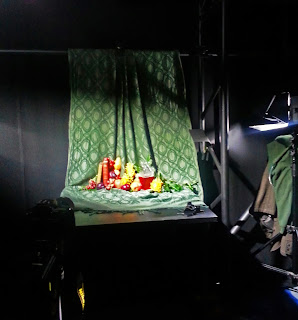
In the past I have helped fellow student Henry Jackson as a wardrobe stylist for some of his fashion photography shoots (see image below) and this morning I took on the role of stylist/ art director during a still life shoot as I help him to visualise his set-ups so he can focus on the lighting and shooting. 

Untitled, Henry Jackson

The shoot was based around Dutch still life paintings as the theme for his work is opulence with rich colours and dark shadows. We went shopping for props that might be suitable and I brought along a green throw to drape in the background. In the end we managed to source a chunky glass decanter, some old books from the antiquarian bookstore, a range of fruit and some bright elaborate flowers.

'Olieverf op doek'', Willem Kalf

    The shoot setup    

This shoot is a test for the finals which will include fashion items and possibly more props such as brass candelabras, in order to practice lighting and layout. I enjoy working with Henry as it allows me to take on a completely new creative role away from illustration whilst also improving my composition skills. Art direction or stylist are both role I would also consider after university as I enjoy the involvement with a team working on something big whereas illustration can be a very solitary career. 

Monday, 4 November 2013

Group critique- reflecting on research report introductions

Today we had a group meeting to discuss the introductions of our research reports. At the moment my question has been altered to 'Is having an agent a useful tool for freelance illustrators in order to be successful in their chosen field of the industry?' which is better than my previous title, asking if agents are a 'necessity' as it was too narrow. I might alter it slightly again but people seemed content that the title was straight forward and to the point of my investigation.

The critique took the same format as before, spending time reading each person's introductions individually and making notes that I now have from my peers to reflect upon. The main piece of feedback seems to be to mention what artists and agencies I will interview in my introduction, and in general to make a list of who I want to contact and get feedback as quickly as possible. I know that I am planning to interview the illustration tutors Matt and Chris, and Chris previously said to me that he would put me in contact with his agency so I need to generate my questions and get those sent out as soon as possible. People also seemed concerned that I make sure to look at illustrators who are unrepresented and collectives that are run by a group of people as an alternative, which is something I am defiantly planning to pursue. I will make sure to go to the library and get some information out on collectives and email some for my research.

Phantom Space Storms, Matthew Richardson

In terms of the structure and content of my introduction the feedback was generally positive, saying my intentions were clear and focused and Catrin said that overall it was a good setting out of my territory. Reflecting on the main body of my essay I received some useful points to consider such as how will I define success; is there another way to define it other than income? Will I judge my findings on personal experiences as having an agent seems to be a personal preference? I suppose the answers to those questions are that money is only half the way to success- personal satisfaction and happiness is the other half so I intend to ask questions that look into whether they were content with their agent, did they get the coverage and progression with that agent or without it that they were looking for? In terms of the other question I haven't quite decided how I will define the answers to my research, I think that is something that will begin to naturally form through my interviews and secondary research and I am certainly aware of the fact that some of the feedback I recieve might be bias. Another question that Catrin posed to me was: 'Is the market changing- can you foresee a time that illustrators no longer need agents?', which could be a good question to pose in my conclusion when looking at the future of my debate. The issue of whether the relationship between illustrators and agents is purely professional or attained on a more personal basis is something to investigate through my questions as well.

'The Collector', Chris Gibbs

The next step seems to be map out what I am going to do chapter by chapter and where my report is going to end up- who will I be interviewing and what will the subject matter of each chapter be? The introduction should map out the territory, like an essay plan and intention- 'a set of instructions'. I also need to make sure to keep a bibliography continually going to make sure I don't forget anything!